
Lorem ipsum dolor sit amet, consectetur adipiscing elit. Ut elit tellus, luctus nec ullamcorper mattis, pulvinar dapibus leo.
The logo design process focused on typography to convey its mission of confidence and elegance. Exploration of various font styles and customization led to a unique brand identity.
The logo’s simplicity and refinement speak to the brand’s commitment to effortless fashion, while subtle integrations of empowering elements enhance its visual impact.
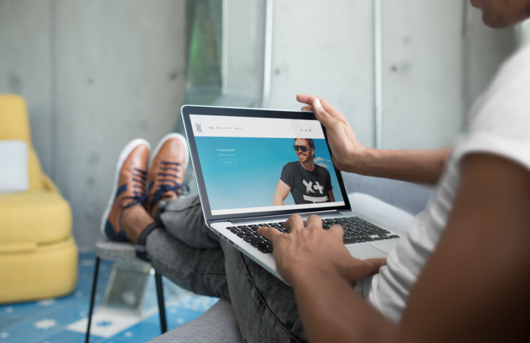
The social media and website design process began with an exploration of identity, values, and audience. The visual aesthetic blended minimalist, sophisticated elements, consistent with the brand’s empowering narrative.
Engaging social media content featured high-quality t-shirts and compelling captions, while the website prioritized a clean layout, e-commerce integration, and user-centric design.

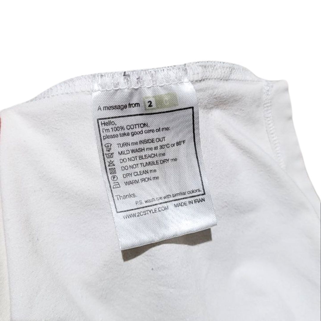
The packaging design process started with understanding the brand’s values and a desire to create a memorable unboxing experience. The result was a compact and elegant box featuring minimalist visuals, the brand’s signature typography.
The design reflects the brand’s commitment to confidence and growth and transforms the act of receiving a t-shirt into an empowering experience.

The logo is designed to embody the brand’s identity, showcasing collaboration, creativity, and uniqueness. It features a picture frame with the faces of the founders, representing the personal touch and dedication behind each Snood creation.
The dynamic typography and vibrant color palette adds glamour and elegance to the brand’s identity. The logo is versatile and scalable, ensuring its applicability across various mediums. The combination of elements creates a captivating representation of the exclusive and creative world of Snood.
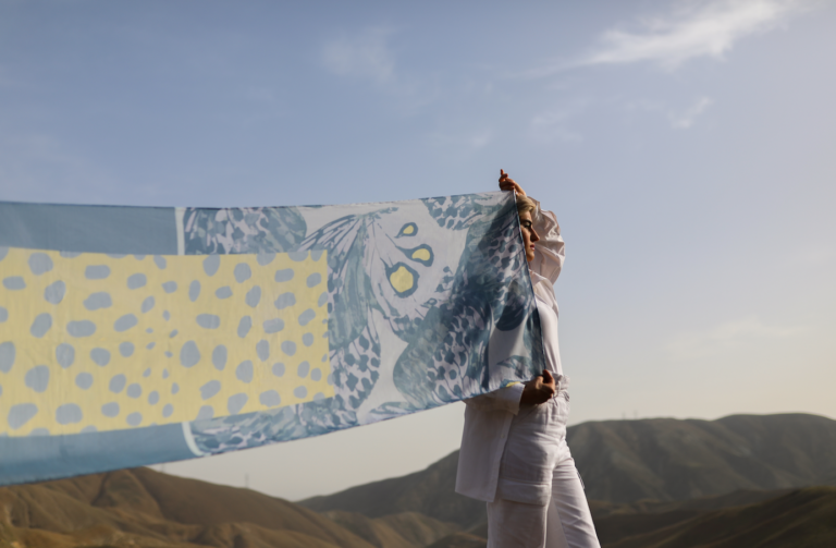
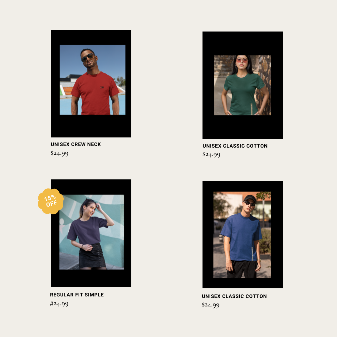
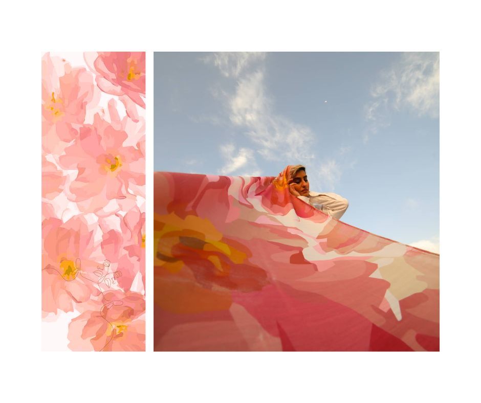
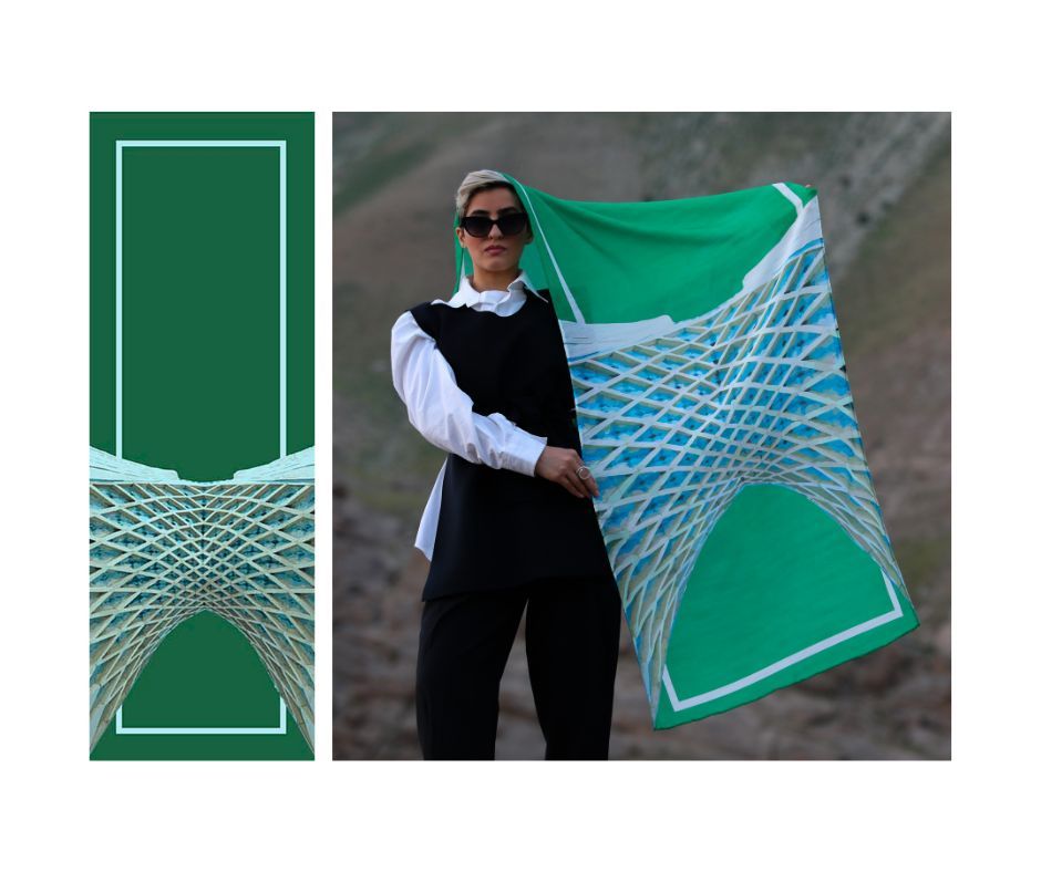
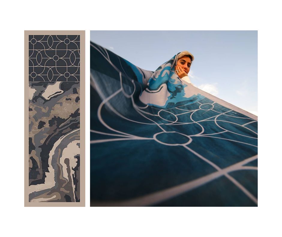
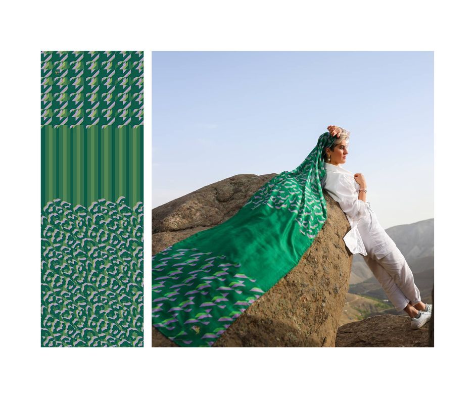
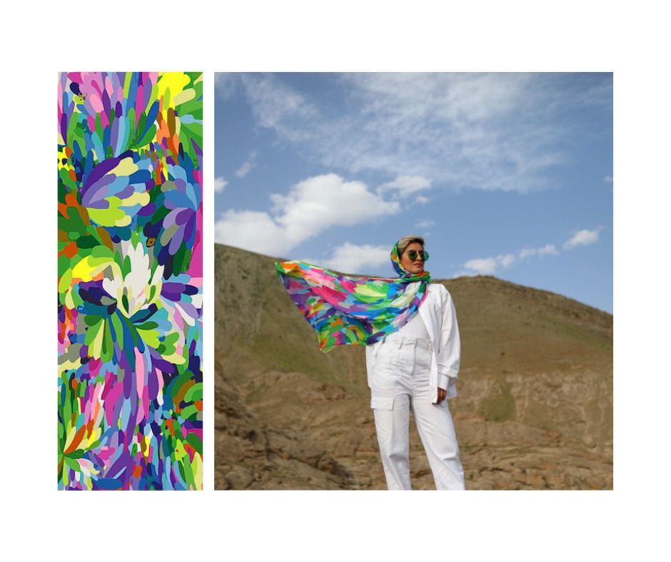
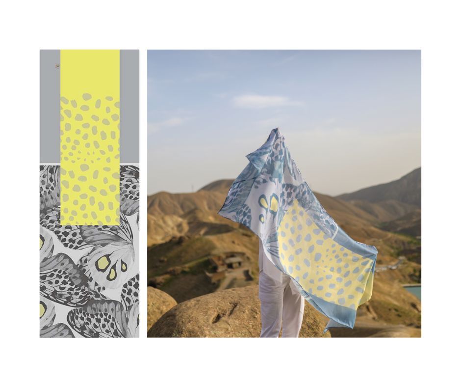
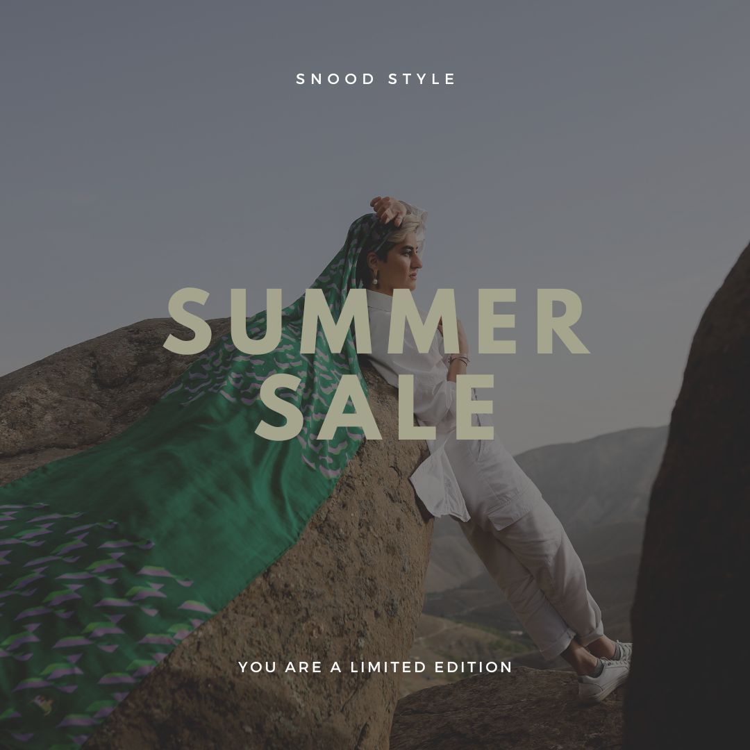
Snood’s apparel graphic design strategy focuses on creating a diverse collection of over 70 scarf designs, each with unique colors and patterns. The collection draws inspiration from various sources, including nature, art, and cultural influences, and the goal is to offer customers a curated selection that transcends traditional scarf design norms. Each scarf design tells a unique story and are released in restricted quantities to add an exclusive allure.
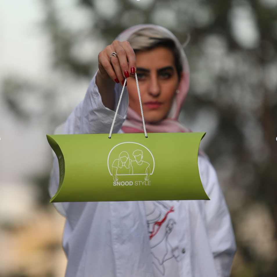
The package design for Snood scarfs aims to elevate the gifting experience while staying true to the brand’s minimalistic and contemporary identity.
Key features include a neutral, clean aesthetic, compact size, easy-carry handle, subtle branding elements, quality materials, a gift-ready presentation, and eco-friendliness.
The unwrapping process is designed to add to the overall experience, emphasizing the simplicity and beauty of the accessory.
Snood’s Instagram posts embody the brand’s vision of simplicity, uniqueness, and contemporary elegance through a minimalist design mood. The imagery showcases individual scarves against neutral backgrounds, allowing the intricate patterns and vibrant designs to take center stage.
Typography and engaging captions maintain brand coherence and offer insights into the inspiration behind specific designs or invite followers to share their own styling stories.
Snood’s minimalist Instagram design creates an immersive and visually appealing space that reflects the brand’s commitment to minimalistic elegance and individual expression.
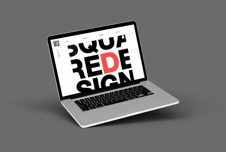
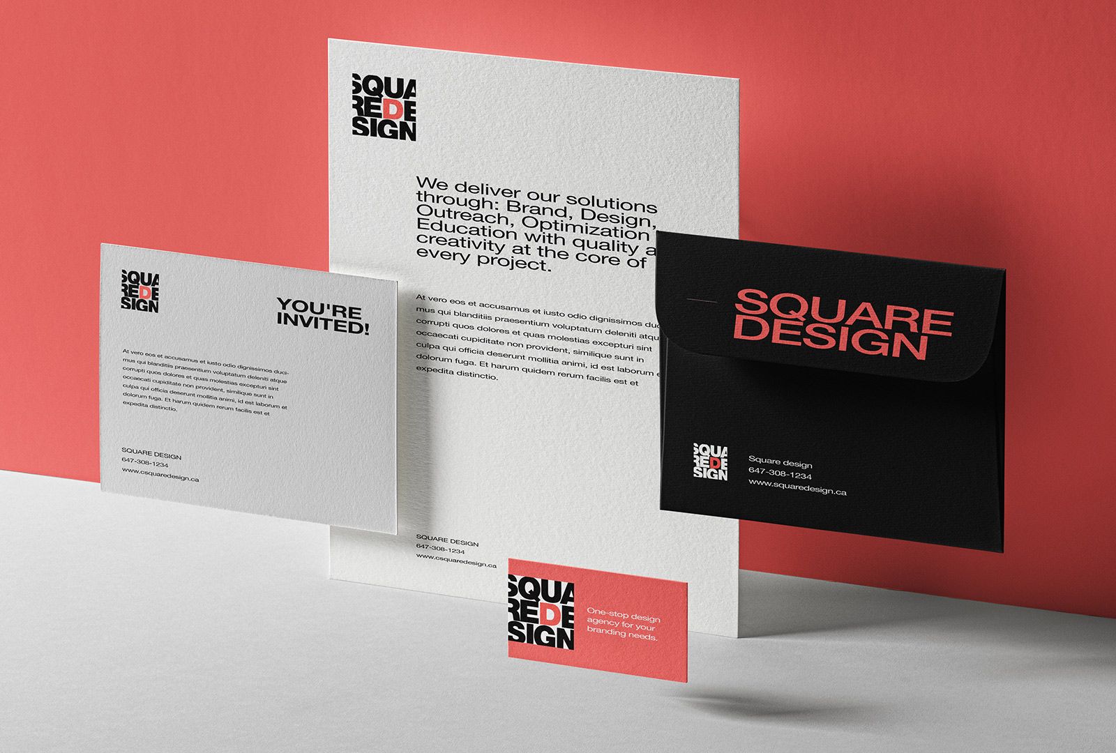
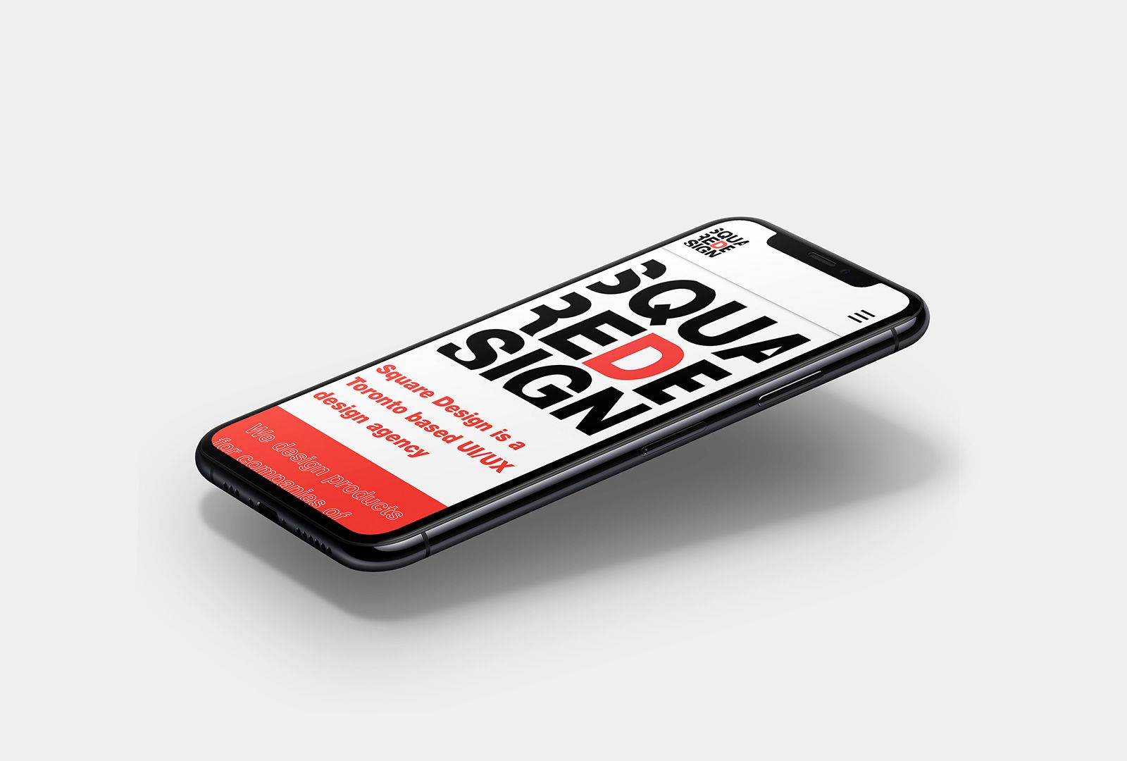
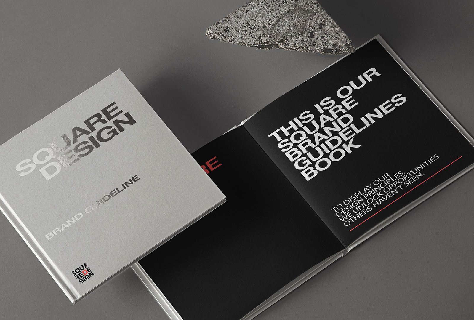
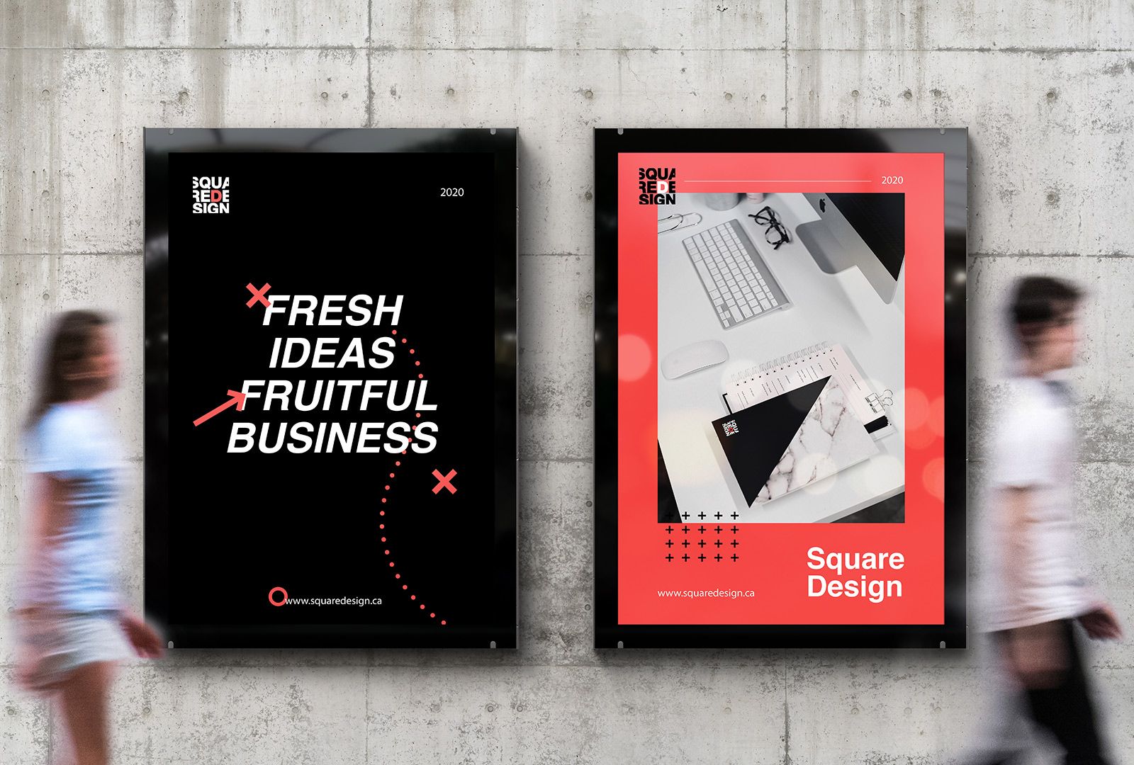
Square Design’s branding and marketing strategy values consistency and innovation. A cohesive visual identity across various touchpoints reinforces professionalism and reliability, while social media platforms showcase creativity.
Logo Design
Reflects its innovative and collaborative approach to UI/UX design, with clean lines, modern aesthetic, and geometric shapes that symbolize precision and balance. The vibrant and sophisticated color palette represents creativity and professionalism.
Website Design
Features a user-friendly layout that showcases the agency’s diverse services through high-quality images and interactive graphics. The responsive design ensures a consistent experience across devices, reflecting the agency’s commitment to adaptability and accessibility.
Packaging Design
Visually appealing and functional solution, through packaging design. The use of colors, typography, and graphic elements to tell a story and align with the brand’s overall visual language.
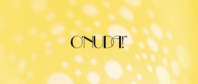
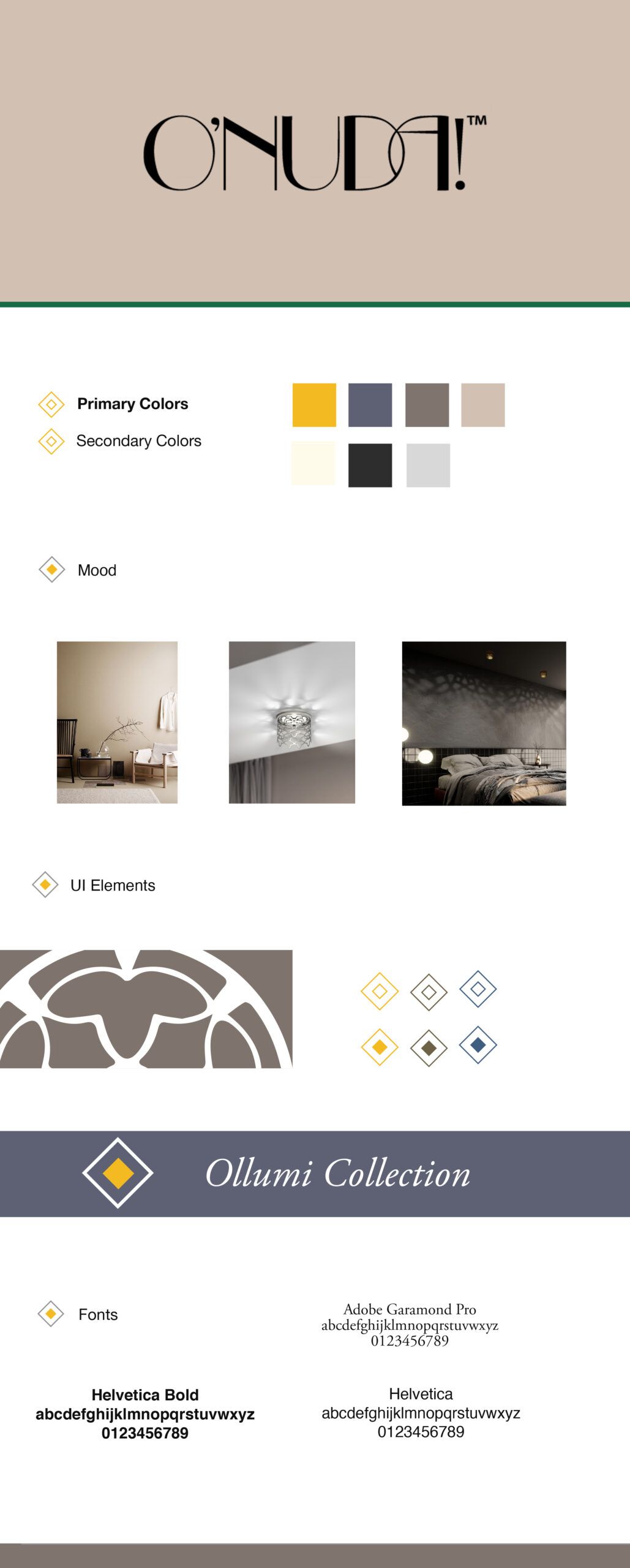
Crafting a logo for O’Llumi Collection involved capturing the brand’s cultural influence and innovative niche. Designed elements inspired by candelabrums discovered in Fez, Morocco, and subtle, vibrant colors were incorporated.
A clean, modern font conveys sophistication, and an abstract representation of a candelabrum or design element inspired by the brand’s story. The logo is versatile, scalable, and instantly recognizable.
A mood board was designed to reflect the brand’s artistic brilliance, soulful home accents, cultural inspiration, and commitment to joyful living.
This included a color palette inspired by cultural symbols, artistic imagery, typography, joyful lifestyle imagery, handcrafted elements, and the brand logo. The mood board served as a visual guide for the brand’s design direction and identity.
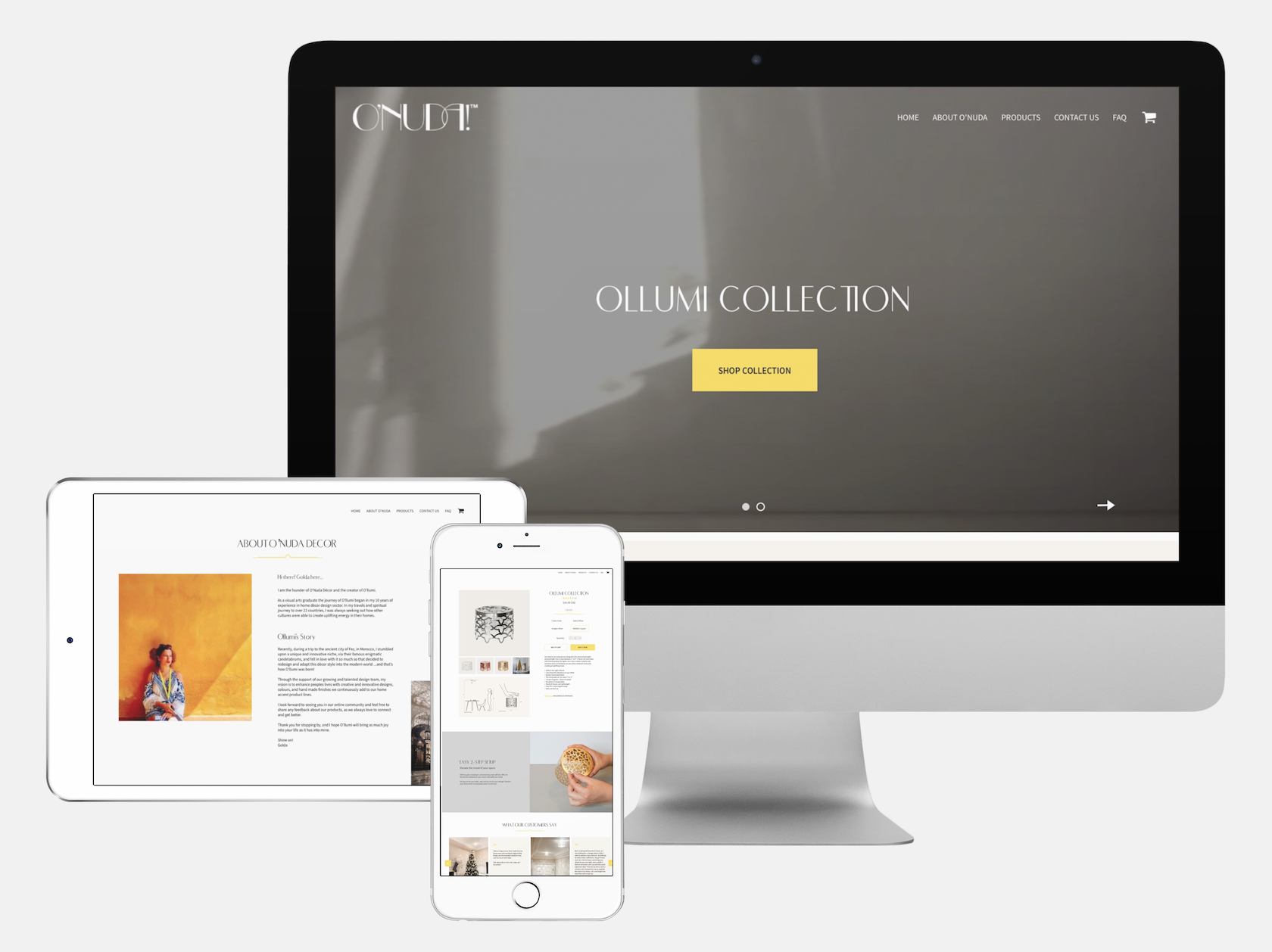
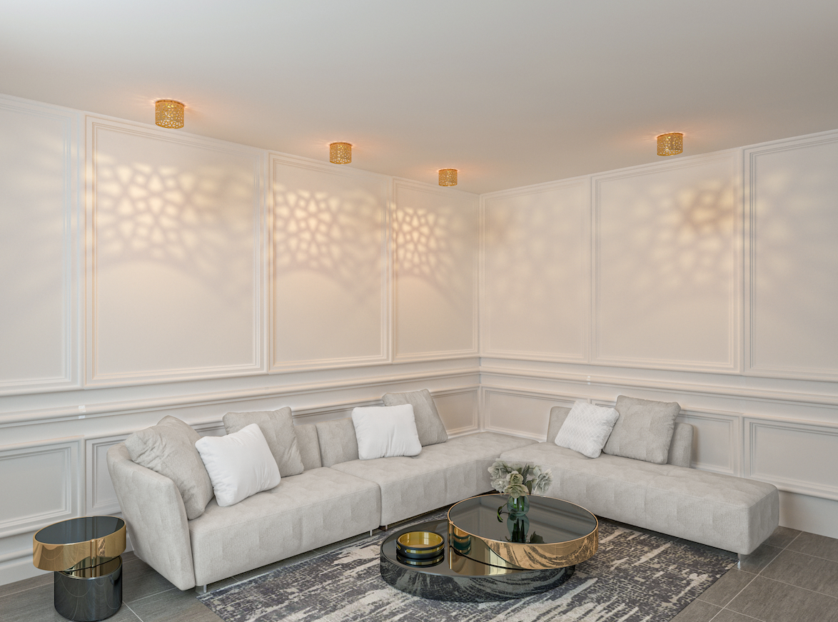
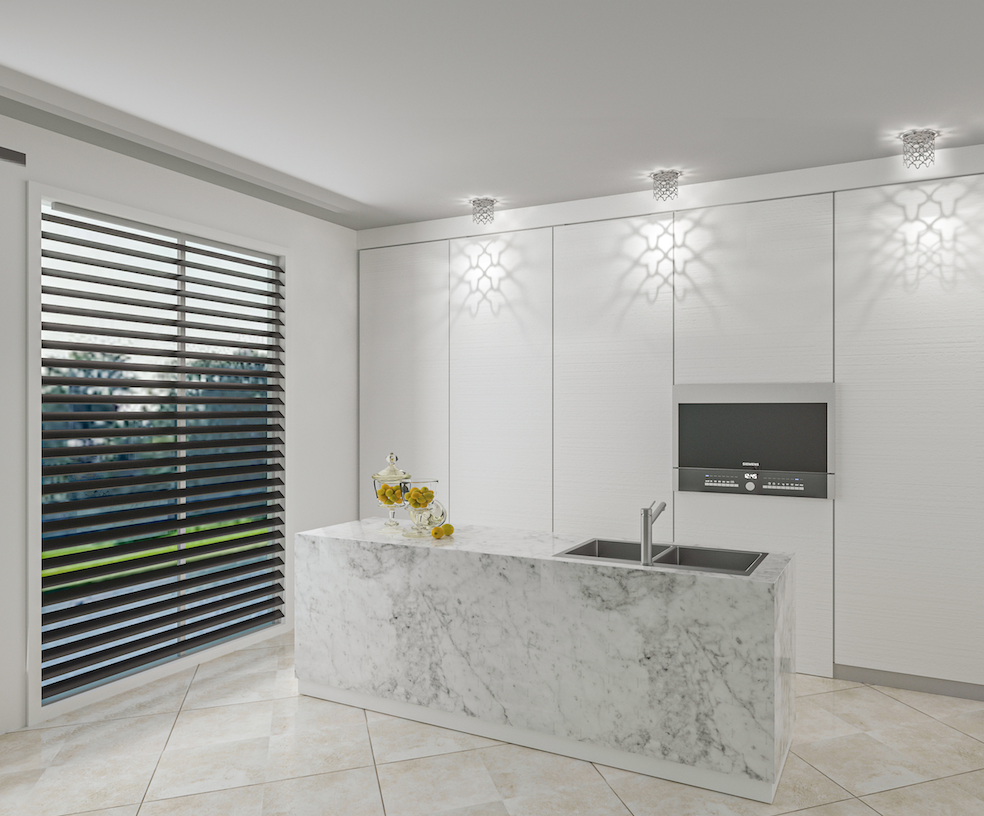
O’Nuda’s website and social media content strategy aimed to showcase their pot light decoration through before and after showcases, videos, tutorials, customer testimonials, interactive stories and polls, and a gallery. The strategy involved product showcases, behind-the-scenes glimpses, and lifestyle content related to home decor.
after showcases, videos, tutorials, customer testimonials, interactive stories and polls, and a gallery. The strategy involved product showcases, behind-the-scenes glimpses, and lifestyle content related to home decor.
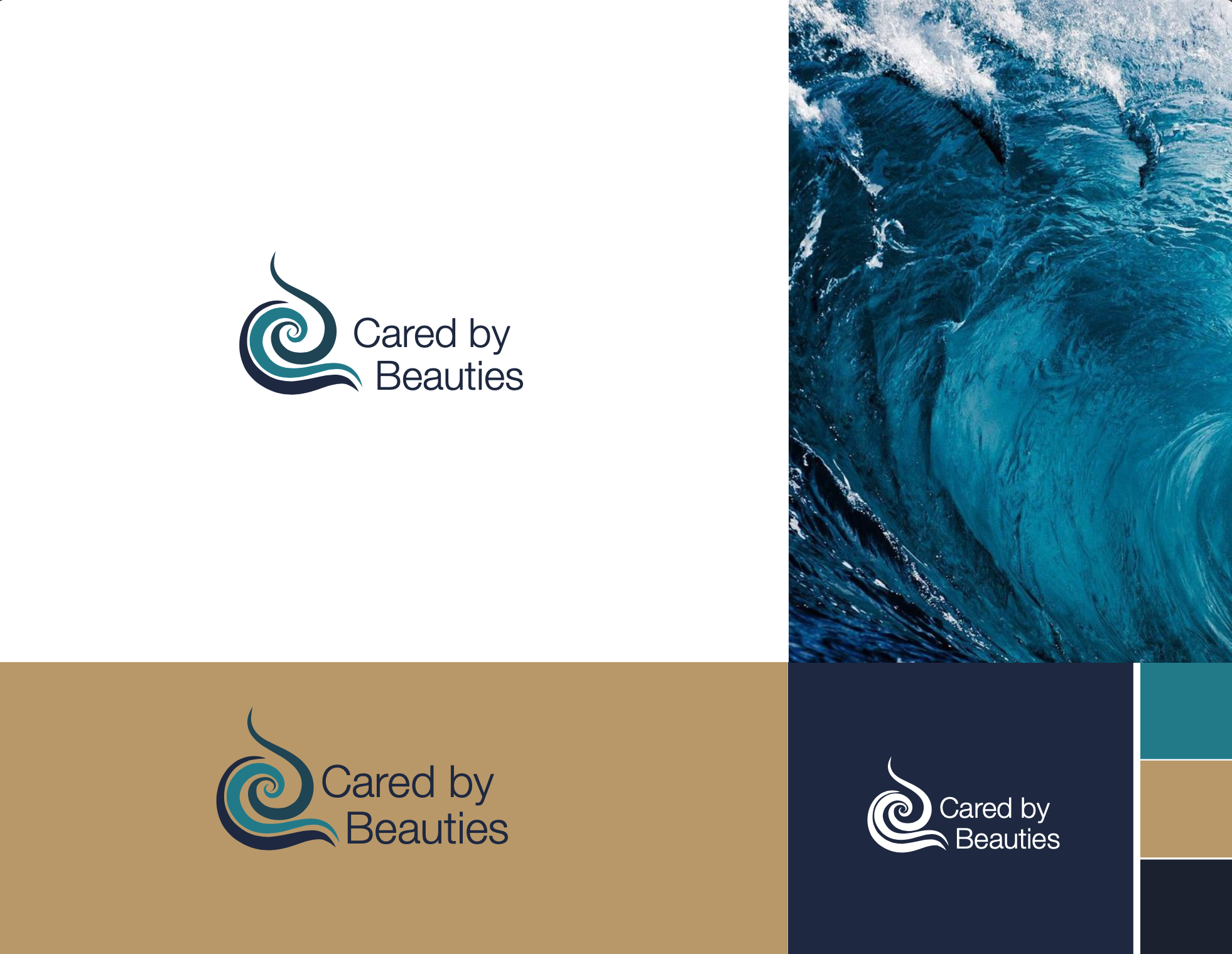
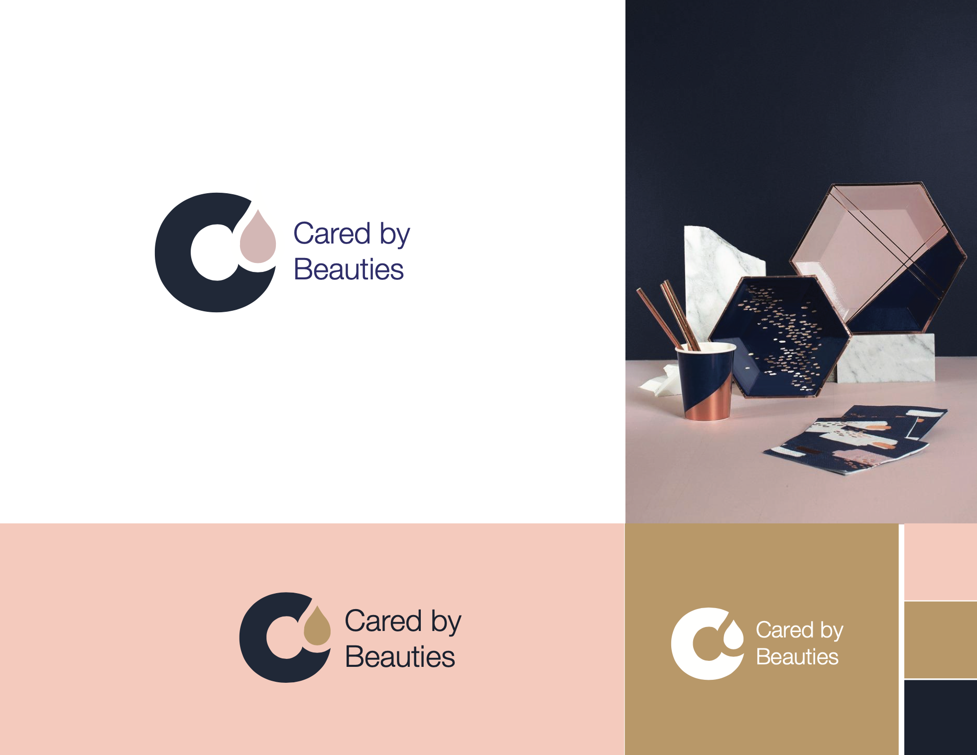
CBB’s logo represented the company’s dedication to innovation, customization, and cleanliness in a visually compelling way. Integrated design elements that reflect the modern and cutting-edge nature of the company.
A sleek, sans-serif font can convey a sense of professionalism, while including an iconic symbol like a cleaning tool or a tech symbol can reinforce the brand’s forward-thinking approach.
A harmonious color palette that includes fresh and clean tones like blues evoke a sense of trust and cleanliness. It was important that the logo is scalable and easily recognizable, making it impactful regardless of where it is displayed – whether on business cards, vehicles, or digital platforms.
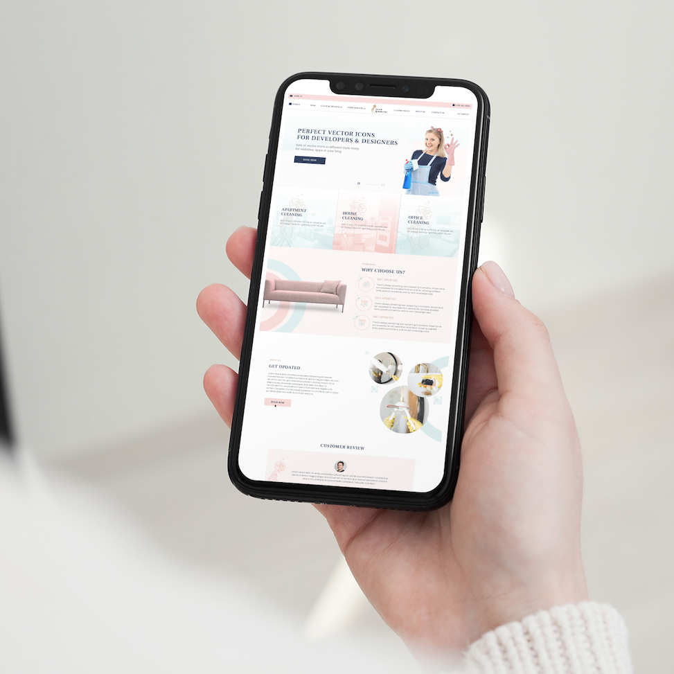
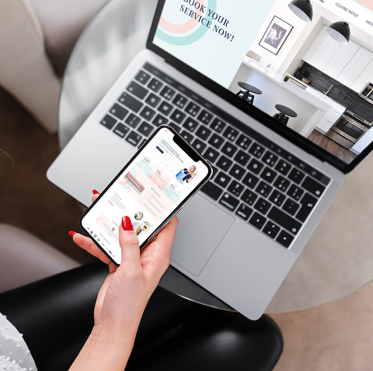
The website design for CBB reflected the company’s commitment to efficiency, customization, and transparency. Key elements that were included were, a clean and intuitive layout, showcasing customization options, highlighting eco-friendly practices, incorporating customer testimonials, and providing transparent pricing and service details.
The website feature high-quality professional images, is optimized for mobile devices, and includes interactive elements. Calls-to-action are clear and strategically placed throughout the site.

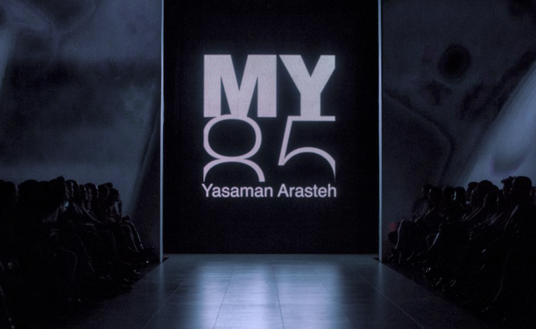
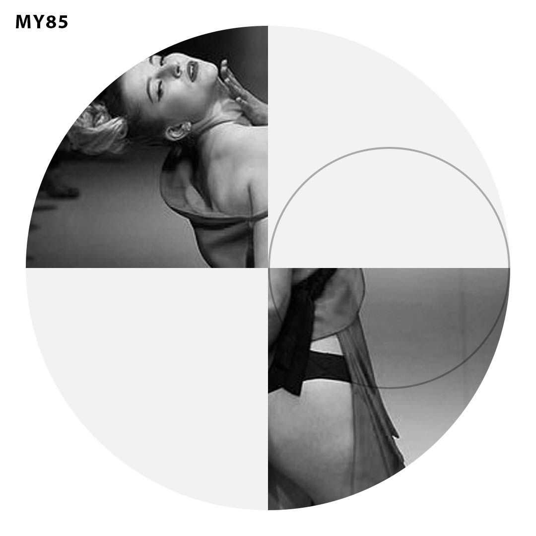
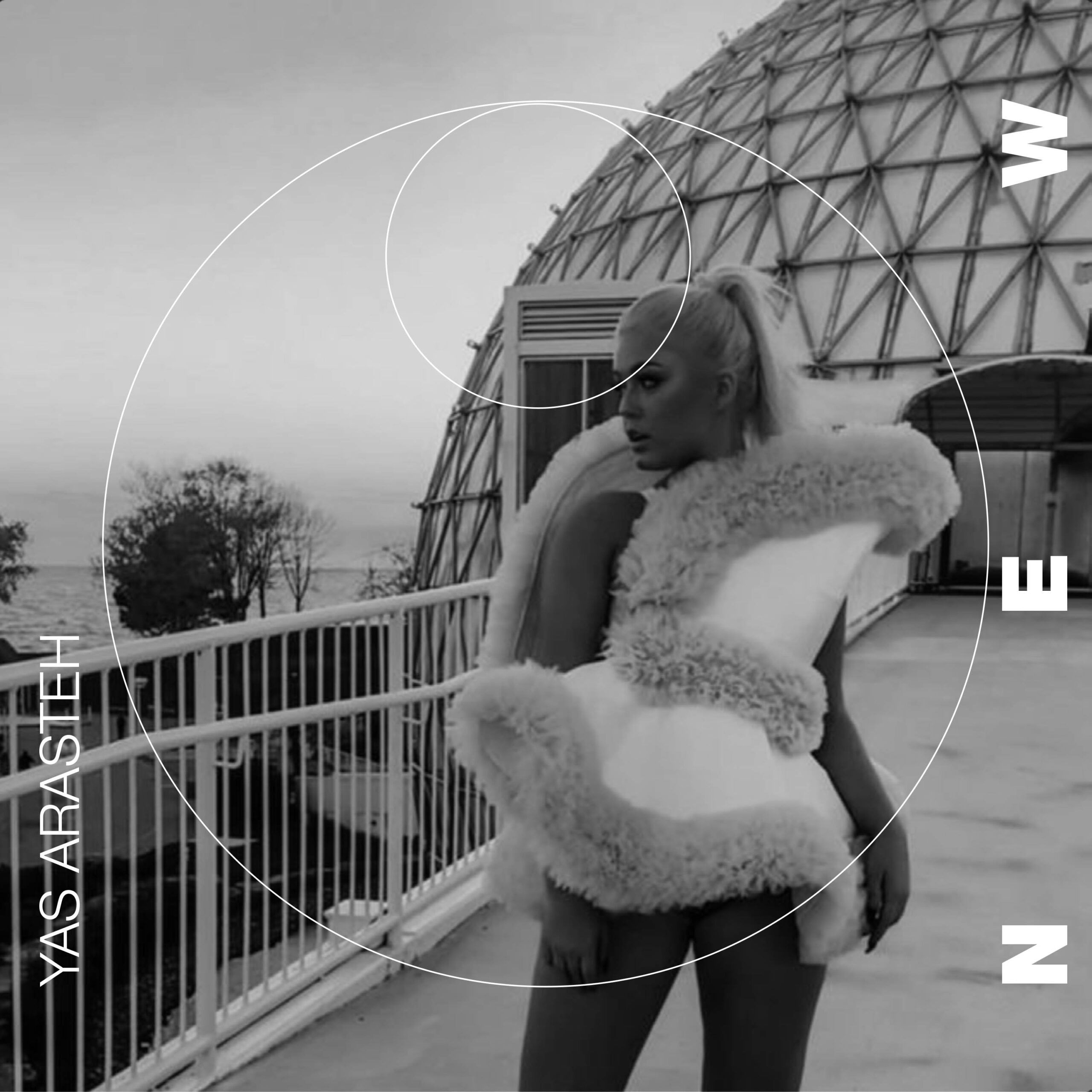
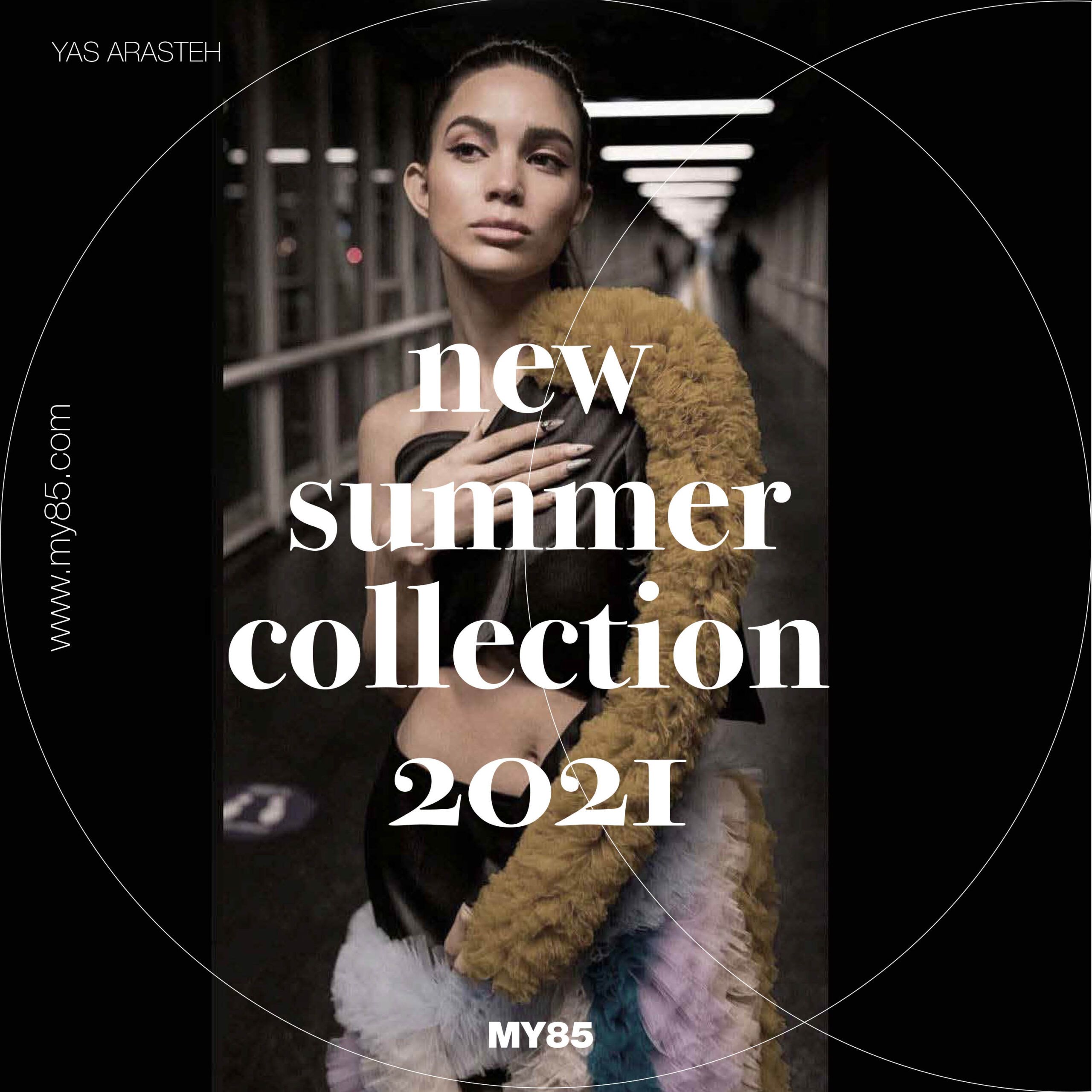
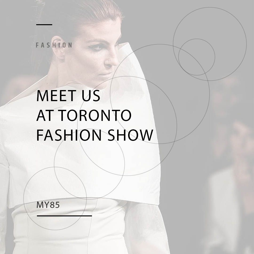
In creating the perfect logo for My85, it was important to capture the brand’s essence – a blend of essential lines, geometric precision, and a contemporary aesthetic.
Integrated abstract shapes that evoke architectural elements to convey a sentse of modernity and style. Monochromatic color scheme is used to maintain the simplicity and sophistication.
Typography is clean and modern, embodying the brand’s commitment to essential lines and timeless design. Ultimately, the logo serves as a visual representation of My85’s exceptional approach to fashion, creating a lasting impression on customers.
Catalogue Makeover:
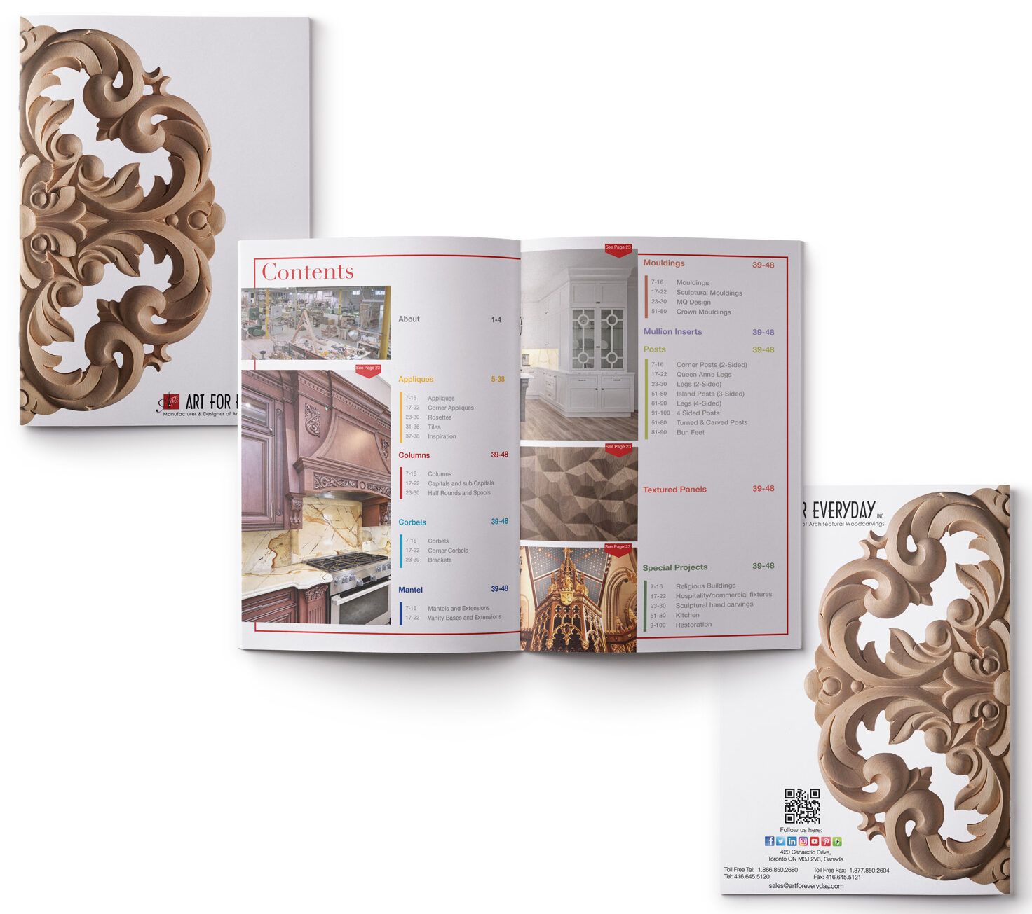
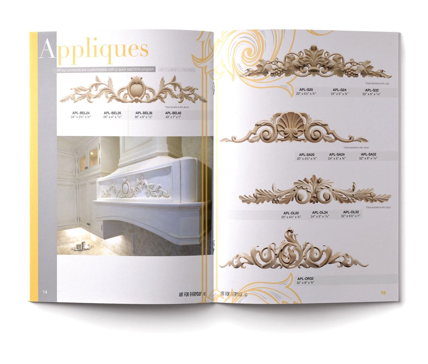
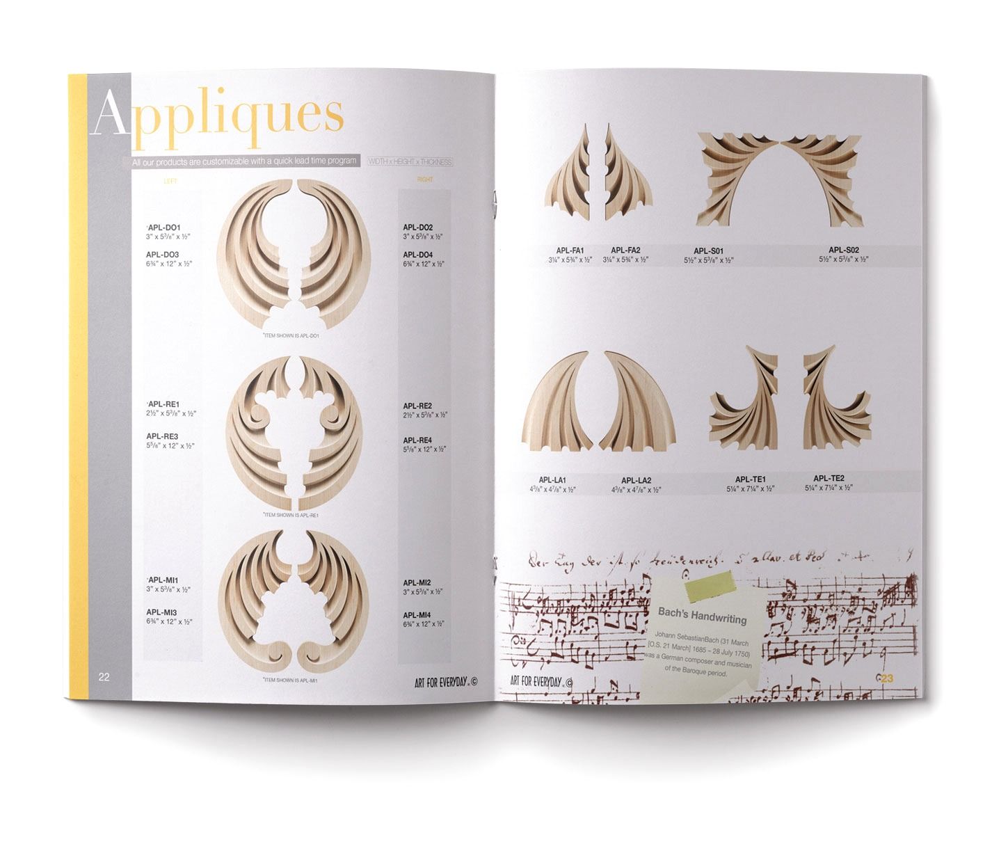
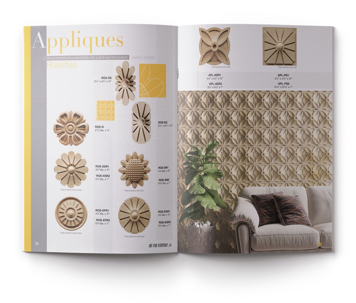
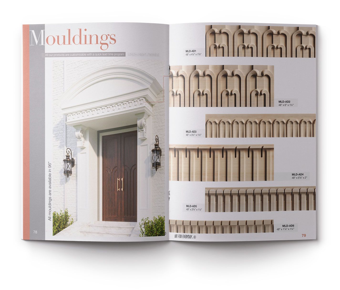
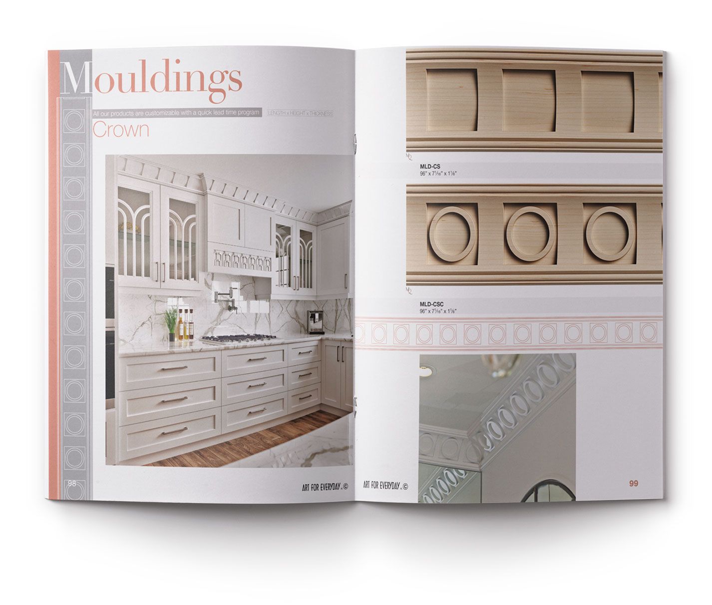
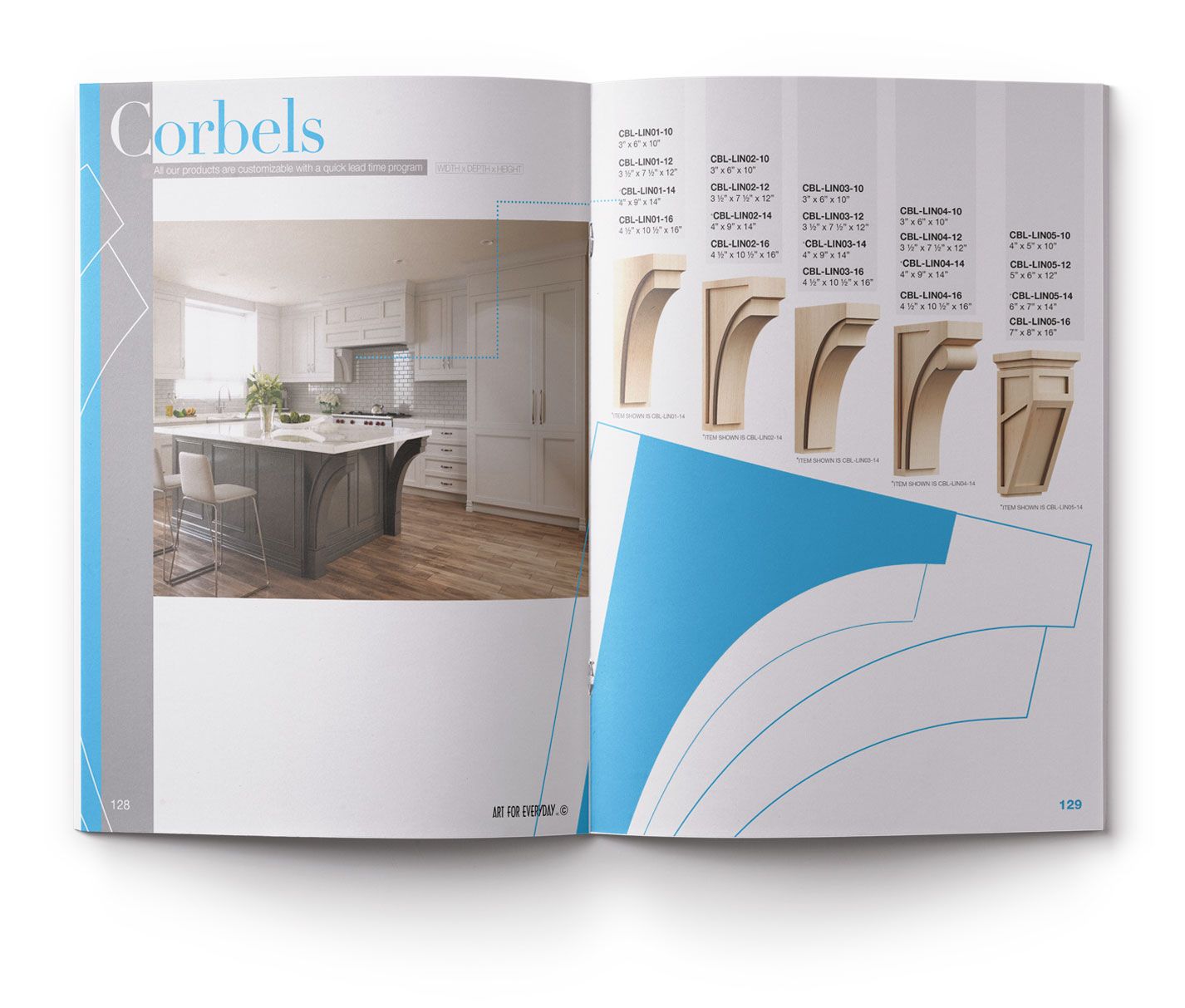
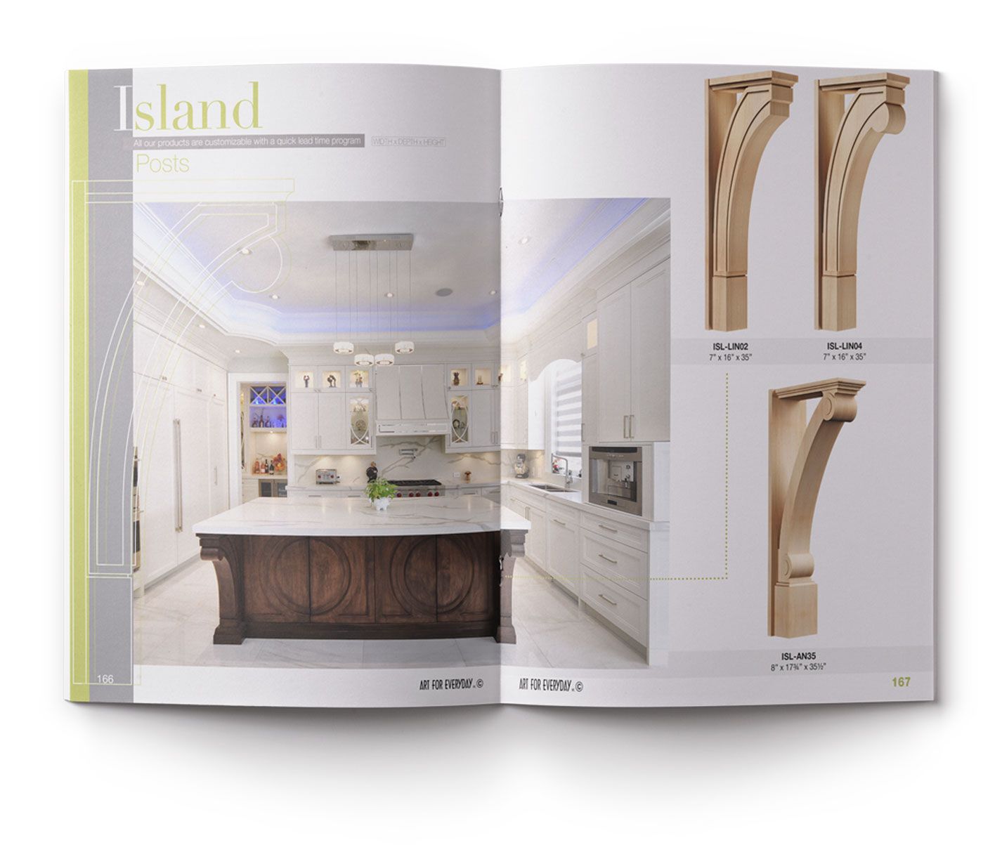
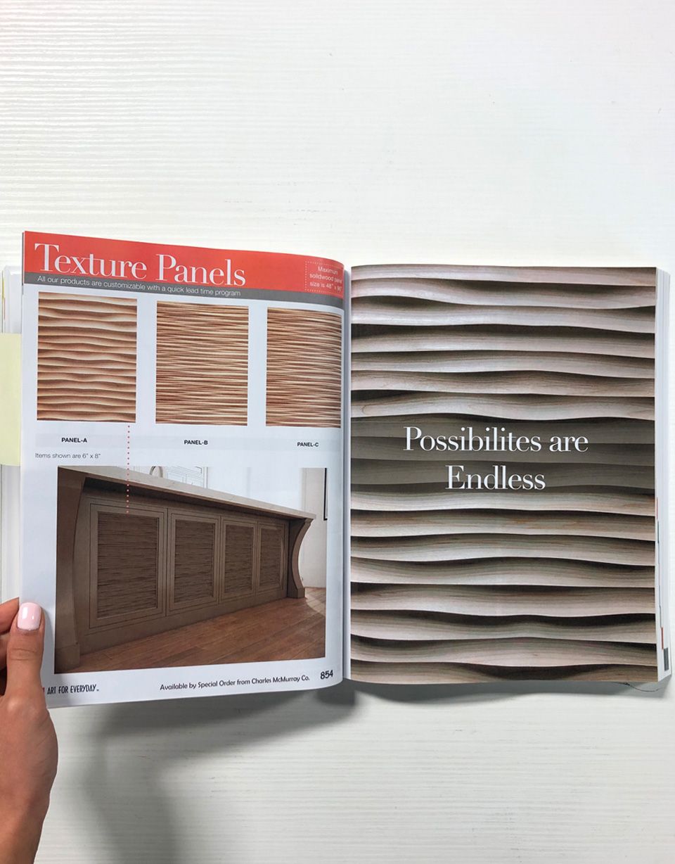
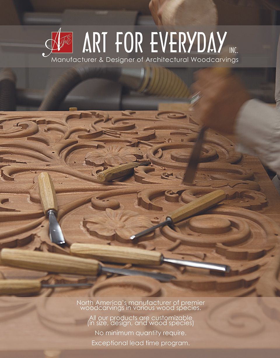
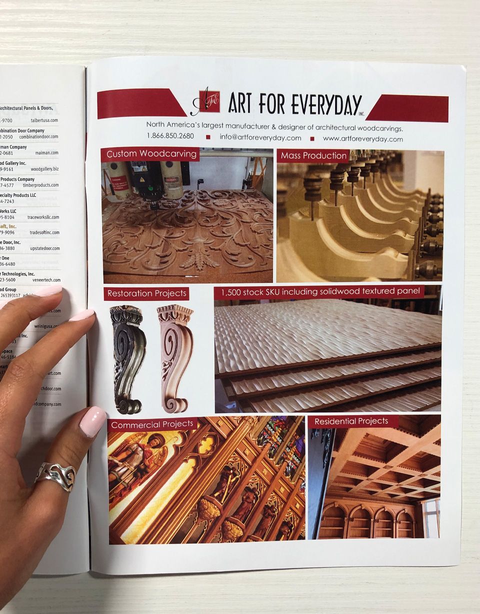
Revamping Art For Everyday Inc.’s catalogue involves employing strategic graphic design methods to enhance visual appeal, improve user experience, and effectively communicate the brand’s values.
Visual Hierarchy:
Established a clear visual hierarchy to guide the viewer through the catalogue. Used bold typography and varying font sizes to highlight key information such as product names, unique design features, and custom carving capabilities. Ensured that the layout encourages a natural flow of information.
Color Palette:
Selected a different colour pallet for each product category allowing the user to easily navigate through the 1,200 + products. Integrated wood tones and subtle, complementary colors to evoke a sense of warmth and craftsmanship. Consistent use of colors throughout the catalogue to create a unified and professional look. When the catalogue is viewed from the side angle each category is easily distinguishable.
Imagery and Photography:
Curated high-quality renderings, that showcase the intricate details of the woodcarvings. Utilized a mix of close-ups and lifestyle shots to provide a comprehensive view of the products. Ensured consistency in image style and tone to create a visually appealing and cohesive catalogue.
Typography:
Choose fonts that align with the brand’s identity and conveys a sense of craftsmanship. Considered a combination of serif and sans-serif fonts for a balanced and elegant typographic approach. Ensured readability across various mediums and sizes.
Grid Systems:
Implemented a grid system to maintain consistency and alignment across pages. This helps organize content in a structured manner, facilitating a logical and visually pleasing progression through the catalogue. Consistent spacing and alignment contributed to a polished overall design.
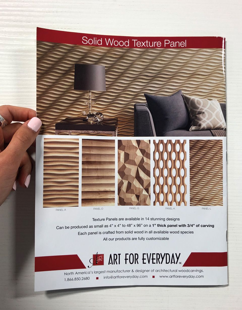
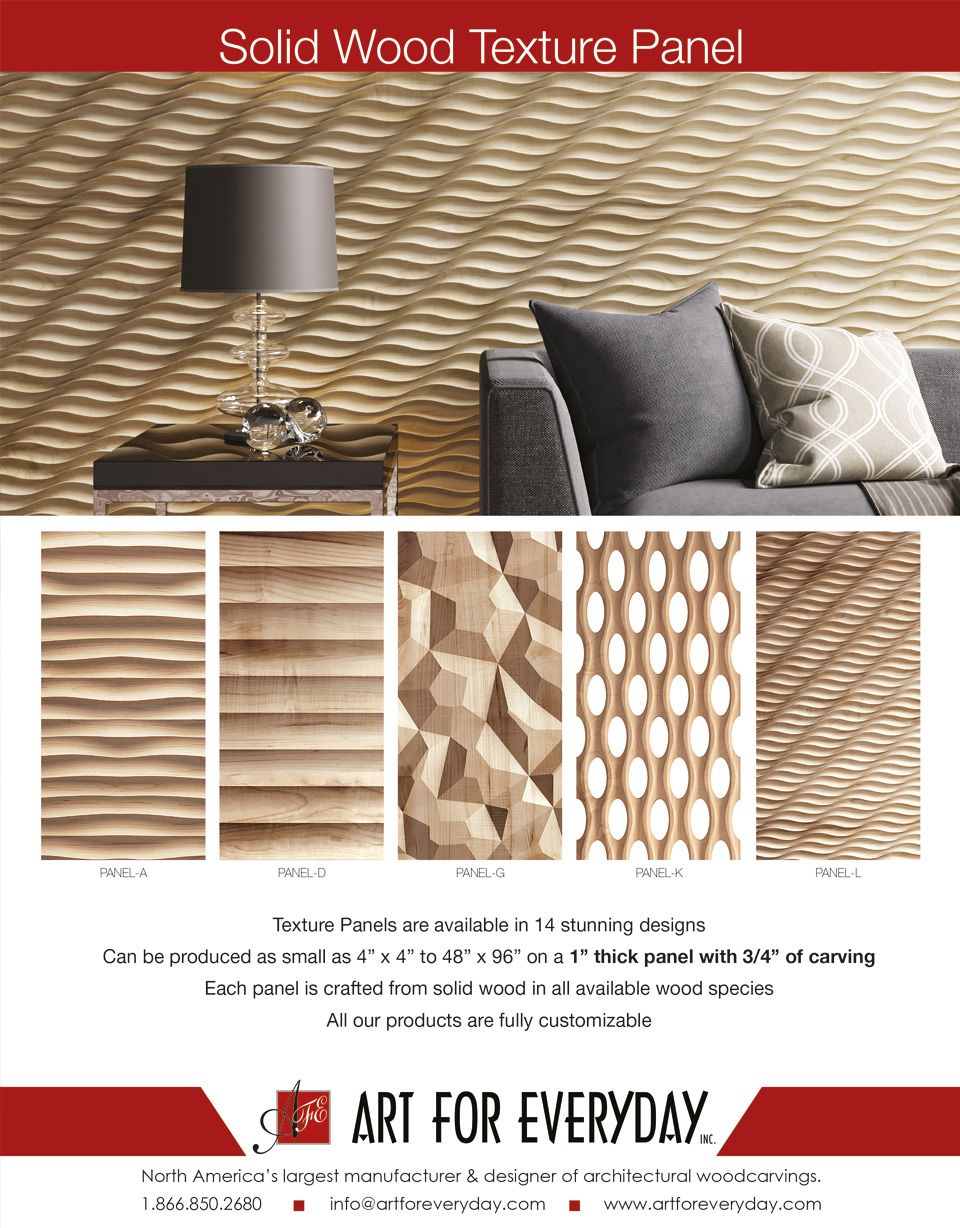
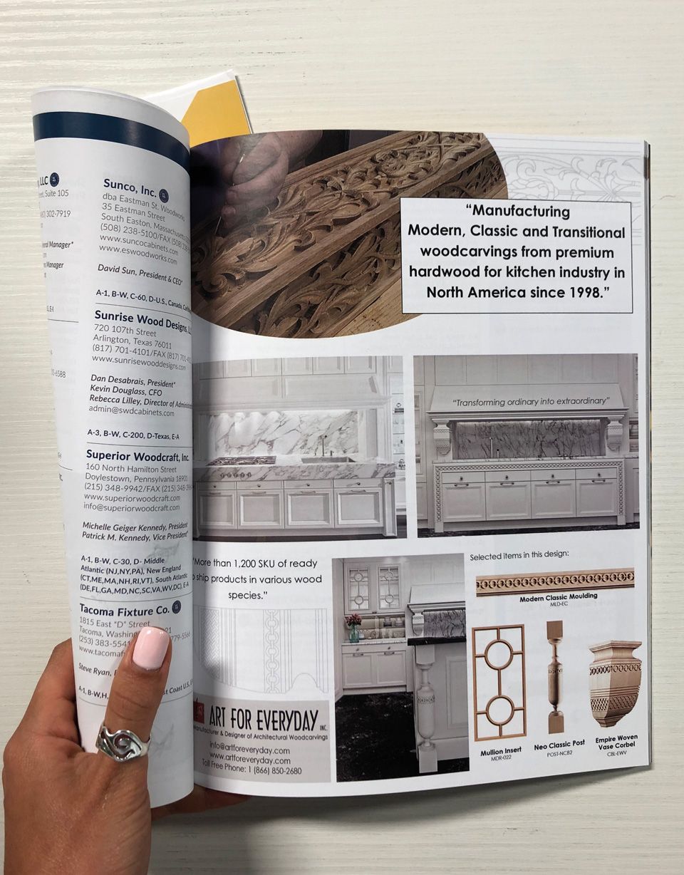
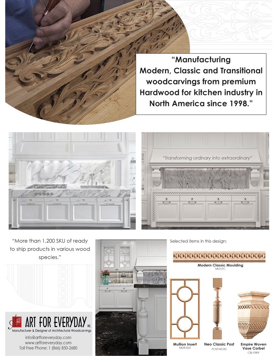
Brochure Design:
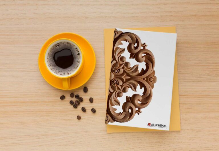
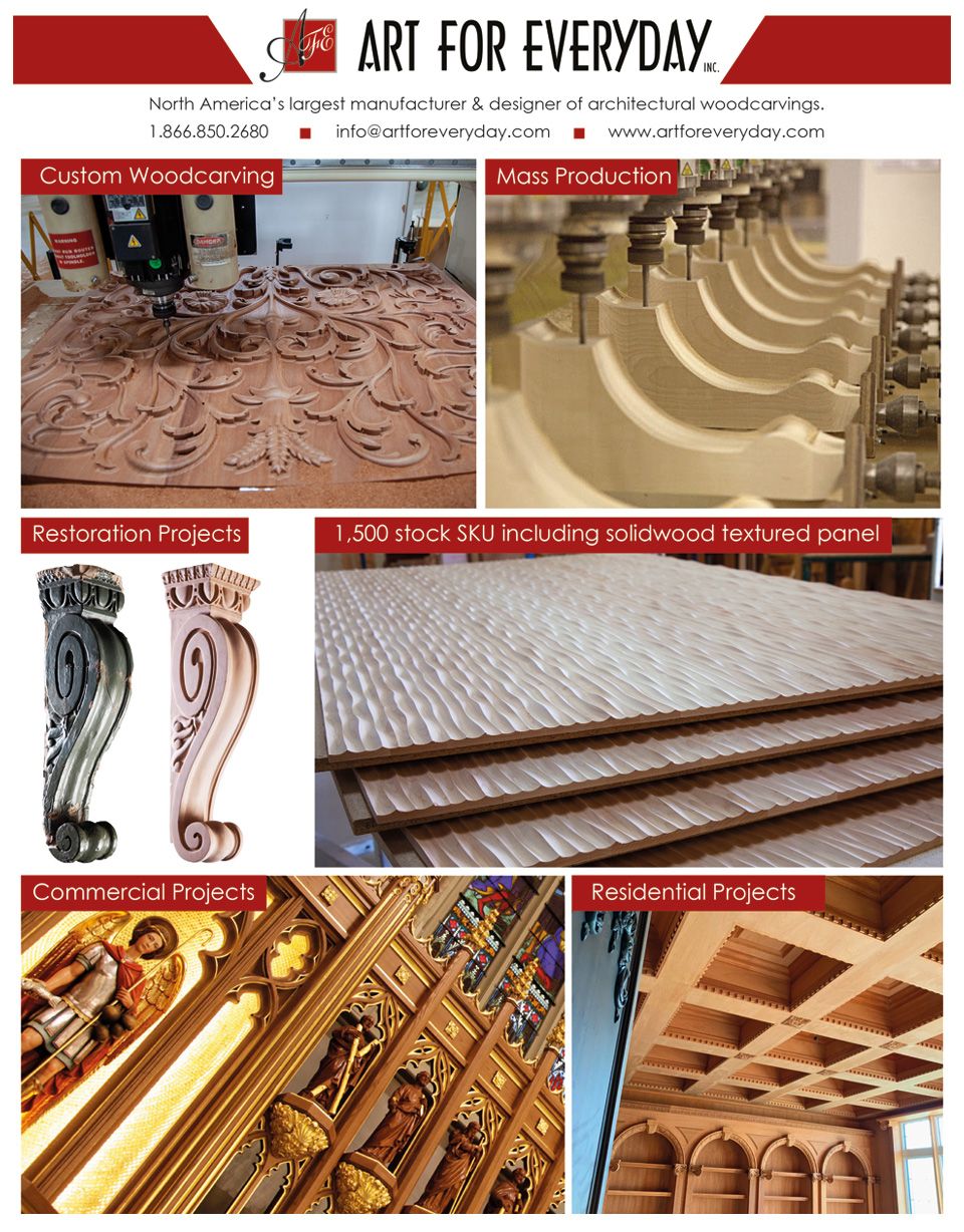
Crafting brochure marketing materials for Art For Everyday Inc. involved employing graphic design methods that captivate the audience, communicate key messages, and visually emphasize the brand’s unique offerings.
Branding Consistency:
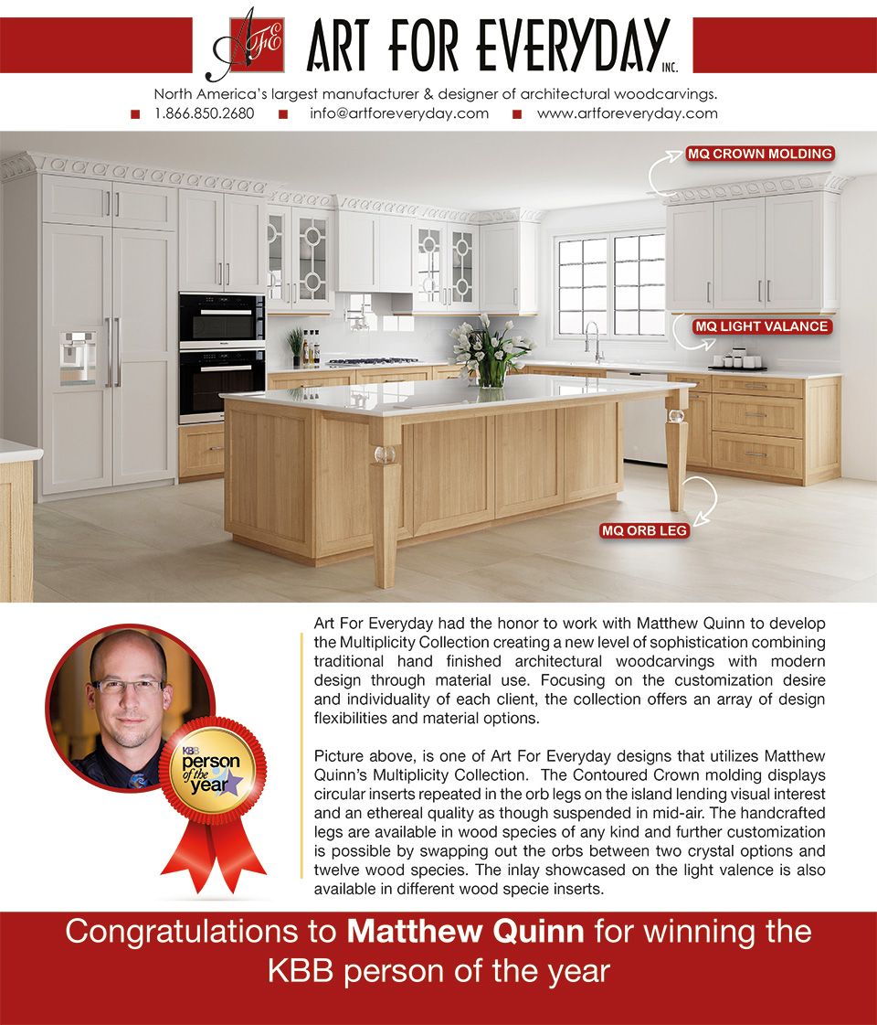
Ensured a seamless extension of the brand by incorporating the company’s logo, color palette, and typography consistently across the brochure. Consistent branding builds recognition and reinforces the brand’s visual identity.
Compelling Imagery:
Curated a selection of high-resolution images/renderings that showcases the intricate details and craftsmanship of Art For Everyday Inc.’s woodcarvings. Used a mix of close-ups and lifestyle shots to convey the products’ aesthetic appeal and versatility.
Information Hierarchy:
Established a clear information hierarchy by strategically placing key details such as product highlights, custom carving capabilities, and the collaborative design process. Used font variations, color contrasts, and layout to guide the reader seamlessly through the content.

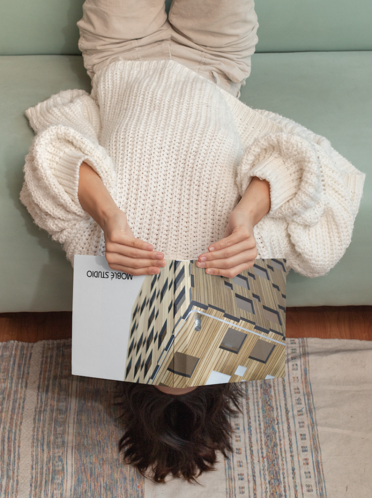
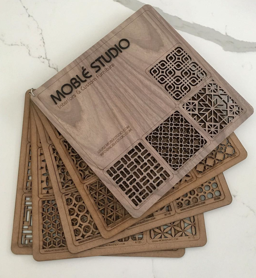
Website design for Moblé serves as a virtual showroom that embodies the company’s values and design philosophy. The digital platform provides an interactive space where visitors can explore the full product range, witness the craftsmanship process, and engage with customization options.
The website’s layout emphasizes simplicity and user-friendly navigation, allowing customers to browse through designs, materials, and dimensions with ease.
Various graphic design techniques were used in editorial and marketing materials to promote Moblé Studio’s handcrafted furniture. These techniques include visual storytelling, customization showcase, material palette infographics, process visualizations, lifestyle photography integration, and typography as a design element.
Conveyed Moblé’s brand narrative, showcased its unique furniture, and engaged customers in a visually compelling manner, while also emphasized the company’s commitment to sustainability and customization.

