
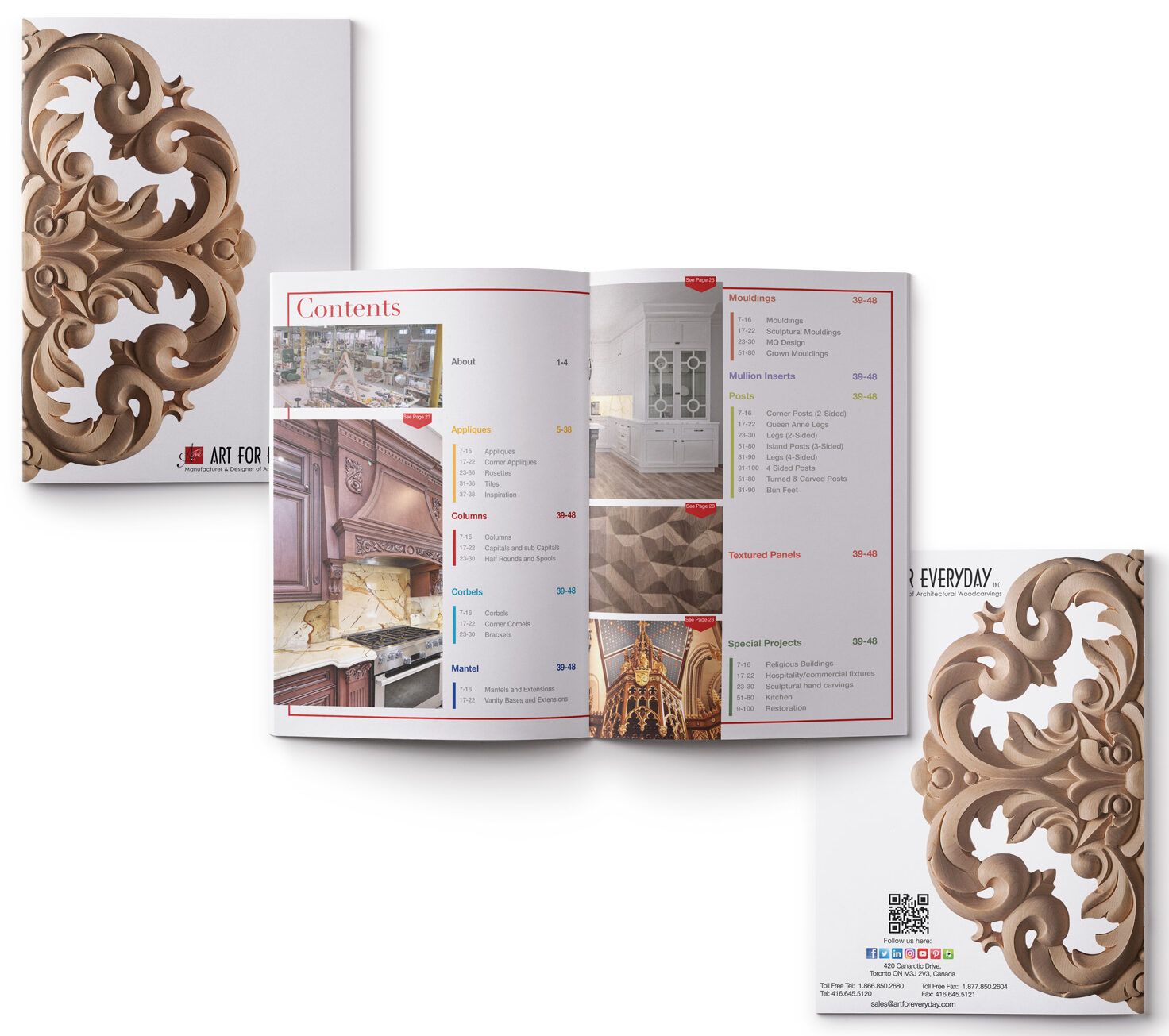
EDITORIAL
Catalogue Makeover:
Revamping Art For Everyday Inc.’s catalogue involves employing strategic graphic design methods to enhance visual appeal, improve user experience, and effectively communicate the brand’s values.
Visual Hierarchy:
Established a clear visual hierarchy to guide the viewer through the catalogue. Used bold typography and varying font sizes to highlight key information such as product names, unique design features, and custom carving capabilities. Ensured that the layout encourages a natural flow of information.
Color Palette:
Selected a different colour pallet for each product category allowing the user to easily navigate through the 1,200 + products. Integrated wood tones and subtle, complementary colors to evoke a sense of warmth and craftsmanship. Consistent use of colors throughout the catalogue to create a unified and professional look. When the catalogue is viewed from the side angle each category is easily distinguishable.
Imagery and Photography:
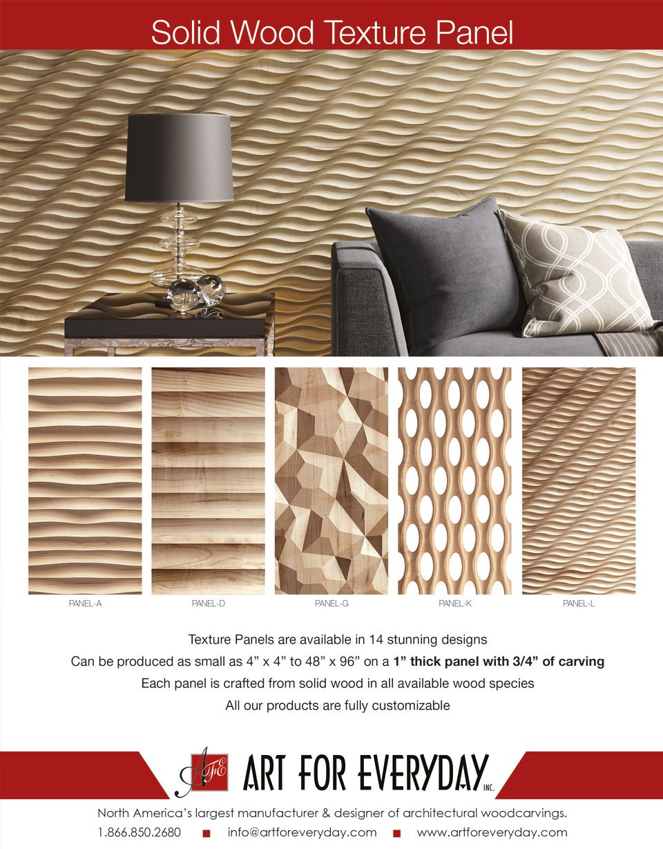
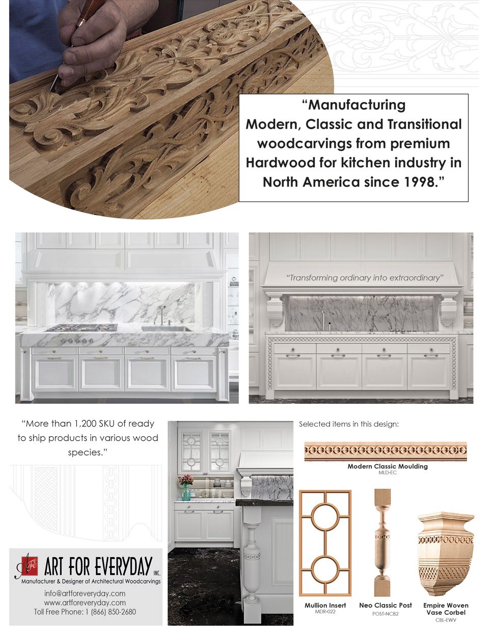
Curated high-quality renderings, that showcase the intricate details of the woodcarvings. Utilized a mix of close-ups and lifestyle shots to provide a comprehensive view of the products. Ensured consistency in image style and tone to create a visually appealing and cohesive catalogue.
Typography:
Choose fonts that align with the brand’s identity and conveys a sense of craftsmanship. Considered a combination of serif and sans-serif fonts for a balanced and elegant typographic approach. Ensured readability across various mediums and sizes.
Grid Systems:
Implemented a grid system to maintain consistency and alignment across pages. This helps organize content in a structured manner, facilitating a logical and visually pleasing progression through the catalogue. Consistent spacing and alignment contributed to a polished overall design.
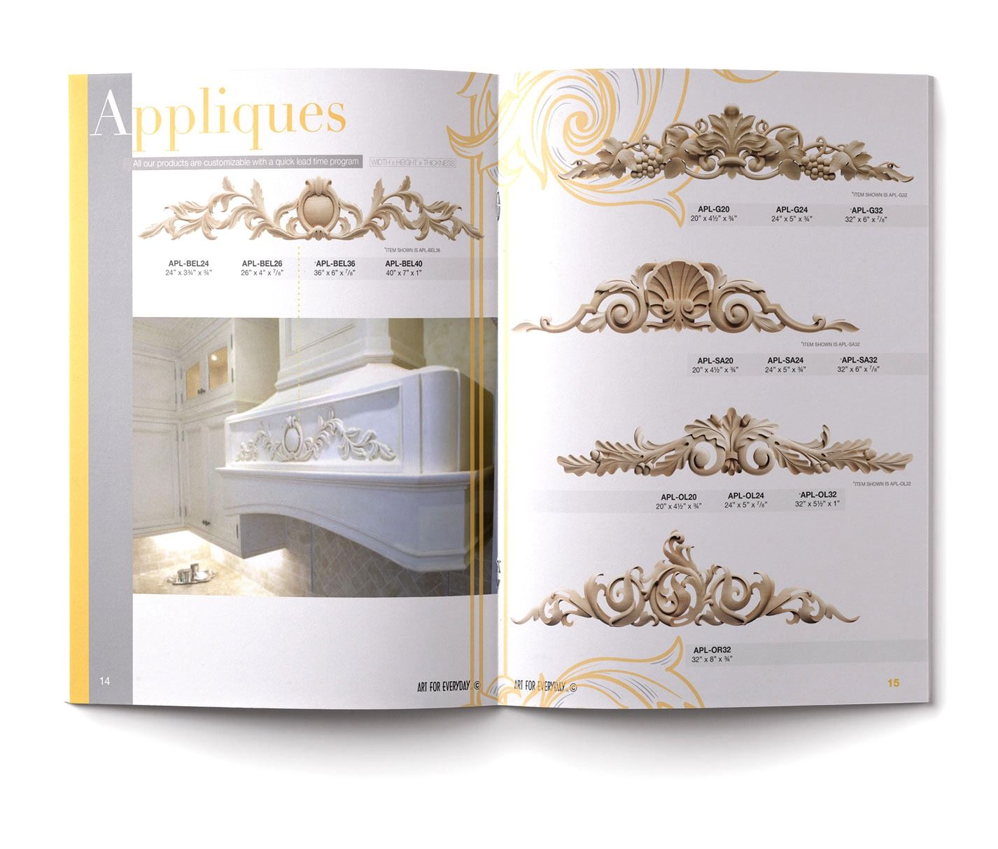
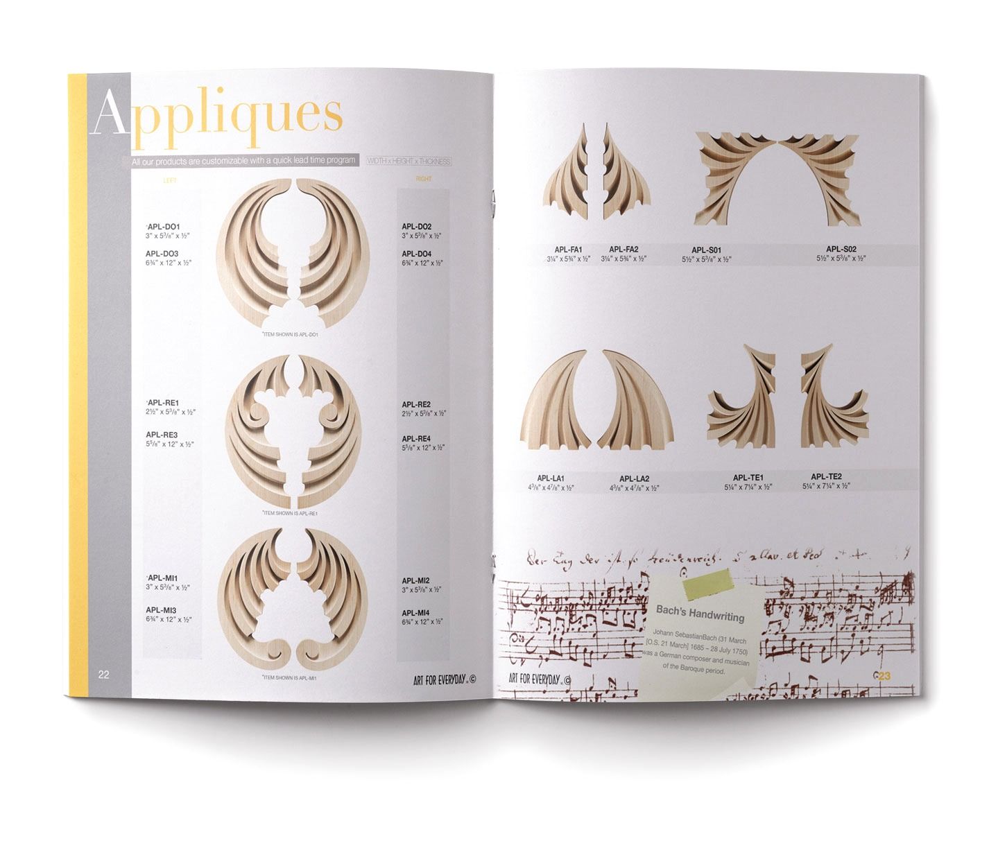
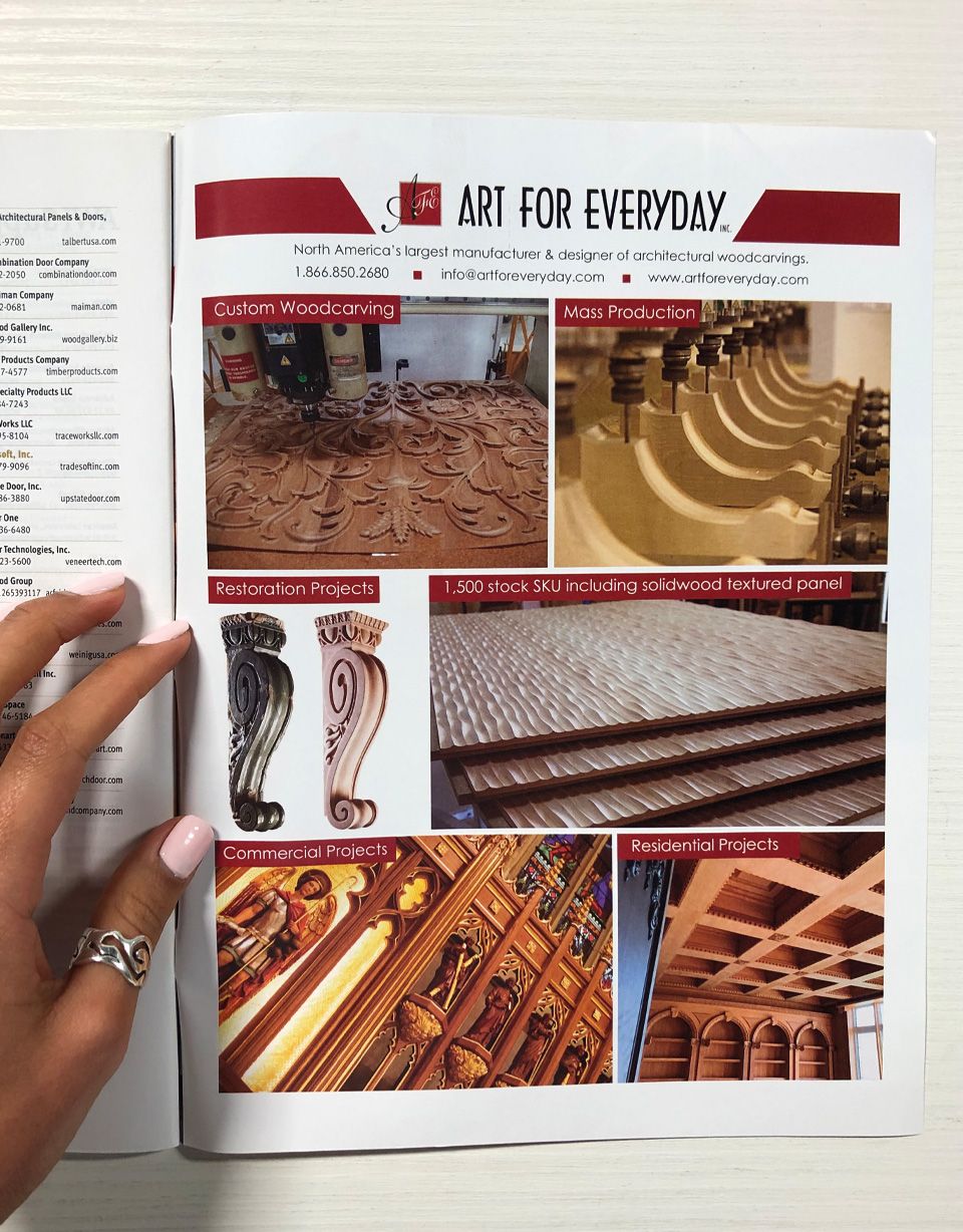
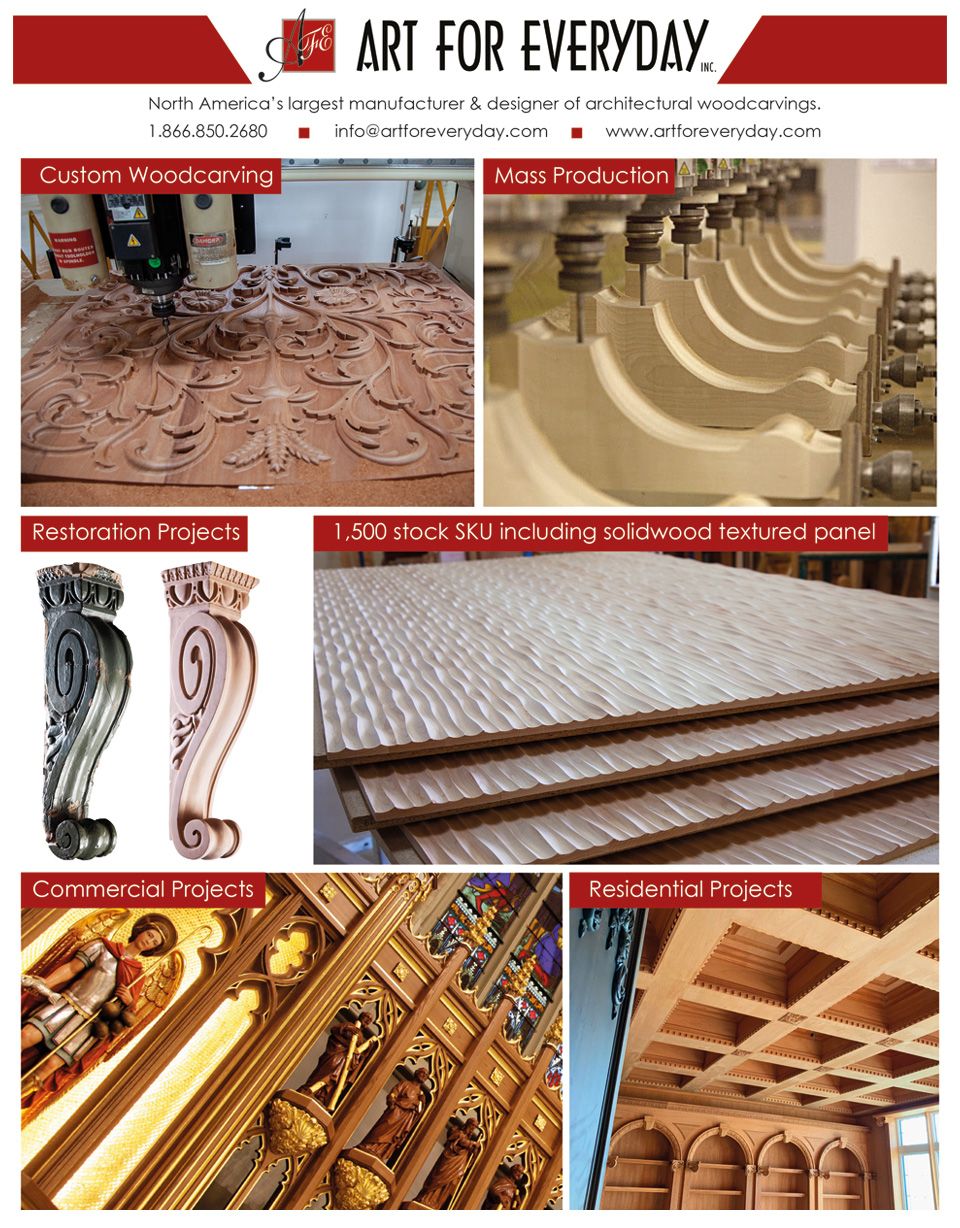
Brochure Design:
Crafting brochure marketing materials for Art For Everyday Inc. involved employing graphic design methods that captivate the audience, communicate key messages, and visually emphasize the brand’s unique offerings.
Branding Consistency:
Ensured a seamless extension of the brand by incorporating the company’s logo, color palette, and typography consistently across the brochure. Consistent branding builds recognition and reinforces the brand’s visual identity.
Compelling Imagery:
Curated a selection of high-resolution images/renderings that showcases the intricate details and craftsmanship of Art For Everyday Inc.’s woodcarvings. Used a mix of close-ups and lifestyle shots to convey the products’ aesthetic appeal and versatility.
Information Hierarchy:
Established a clear information hierarchy by strategically placing key details such as product highlights, custom carving capabilities, and the collaborative design process. Used font variations, color contrasts, and layout to guide the reader seamlessly through the content.